Here are the slides I presented at the Aachen Institute for Advanced Study in Computational Engineering Science of RWTH University Aachen.
Slides for EU Regional School
Leave a reply
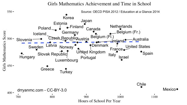
Since I was in middle school, I have heard a drum beat of the need for American schoolchildren to spend more time in school and on homework to catch up to our international peers.
This is true today as well. I’ve seen some gut-wrenching articles about ditching summer vacation, and even the President has opined on extending the school day and year.
My narrow, empirical data tells me that we have been extending the school day for decades and we have not seen any results. This belief has led me to expound to anyone I think will be receptive to the idea that:
“If someone were to make a chart showing time in school versus achievement, I bet there would be a negative correlation.”
Just recently, a colleague Carlos Jerez Hanckes (@cfjerez) replied, “And you should be the one to make that chart.”
Challenge Accepted. But first, a warning
In the last post, I showed how we could use a root finding algorithm to find a drivetime isochrone around a given point. The function had two drawbacks: it evaluated the drivetime between the starting point and other locations many times, and it could only draw convex polygons. The first issue is only a problem if calling a route finder (like Google Maps) has a limit (which it typically does); the second will cause the found polygon to be slightly incorrect if the true polygon is non-convex.
Below I will show a method that finds a drivetime isochrone by evaluating the drivetime at a grid of points around the origin and then uses ggplot to draw the level curve (i.e., contour) at a given drivetime.
For this algorithm we need two R packages geosphere and ggmap.
#find a place 5 minutes away in a given direction
library(geosphere)
library(ggmap)
library(dplyr)
I will also use this crude distance function to set the bounds of the grid. This same function was defined last time.
crude_distance = function(lat,lon,distance) {
  output= data.frame(lat=distance/69,lon = 0)
  output$lon = distance/((-0.768578 - 0.00728556 *lat) * (-90. + lat))
  output
}
Finally, I will define this function that takes in the lat/lon of the origin, the desired drivetime for the isochrone, and the number of points in each direction in the grid (the total number of points the drivetime is evaluated at is this number squared). Finally, there is a multiplier that allows the user to adjust the bounds of the grid. Basically, this multiplier should be 1 if the maximum distance one can travel in one minute is 1 mile.
The function creates a grid of points around the origin and then evaluates the drive time in minutes at all these points. It returns this set of points and the drive time in minutes to get to them.
findDist <- function(lat,lon, drivetime, pts = 5, multiplier=1.0){

 #these next lines create the upper bound lat and lon using the crude_distance
 #function and then store this upper bound in a data frame
 distance = dt*multiplier
 DeltaDF = crude_distance(lat,lon,distance)
 lats <- data.frame(lat=seq(from=-DeltaDF$lat,to= DeltaDF$lat, length.out=pts) + lat)
 lons <- data.frame(lon=seq(from=-DeltaDF$lon,to= DeltaDF$lon, length.out=pts) + lon)
 distanceDF <- expand.grid(lats$lat,lons$lon)
 names(distanceDF) <- c("lat","lon")
 distanceDF <- mutate(distanceDF,loc=paste(lat,lon))
 count = 1
 for (i in 1:nrow(lats)){
   tmp <- mapdist(to=distanceDF$loc[count:(count+pts-1)], from = paste(lat,lon))
   distanceDF[count:(count+pts-1),"minutes"] = tmp$minutes
   count = count+pts
 }
 distanceDF
}
As before, remember that the Google Maps API does have limits to how many times you can call it in a given period. If you exceed that limit, the function above will give errors.
Repeating the example from the previous post gives the following result.
#get a google map for Columbus, OH
cmb = get_map("Columbus, OH", zoom= 11)

#geocode our points of interest
geocode_locations = data.frame(place=c("2762 Sullivant Ave, Columbus, OH 43204","411 Woody Hayes Dr, Columbus, OH 43210","6601 Huntley Road, Columbus, OH 43229","2300 East Dublin Granville Road, Columbus, OH"),names=c("Fine Line Ink","Ohio Stadium","Jack Maxton Chevrolet","Auto Direct Columbus"),stringsAsFactors = F)
geocode_locations[,c("lon","lat")] = geocode(geocode_locations$place)

#the desired drivetime
dt = 10

#call the function
distanceDF = findDist(lat = filter(geocode_locations, names=="Ohio Stadium")$lat, lon = filter(geocode_locations, names=="Ohio Stadium")$lon, drivetime = dt, pts=30, multiplier = 0.85 )


#format the theme for the map
theme_clean <- function(base_size = 8) {
    require(grid)
    theme_grey(base_size) %+replace%
    theme(
        axis.title      =   element_blank(),
        axis.text       =   element_blank(),
        axis.text.y = element_blank(),
        axis.text.x = element_blank(),
        panel.background    =   element_blank(),
        panel.grid      =   element_blank(),
        axis.ticks.length   =   unit(0,"cm"),
        axis.text       =  element_text(margin   =   unit(0,"cm")),
        panel.margin    =   unit(0,"lines"),
        plot.margin     =   unit(c(0,0,0,0),"lines"),
        complete = TRUE
        )
    }

#make the map
ggmap(cmb)+ stat_contour(data=distanceDF, aes(x=lon,y=lat,z=minutes),breaks=c(0,dt), geom="polygon",size=1, fill="yellow",color="blue", alpha=0.5) + geom_point(data=geocode_locations,aes(lon,lat,color=names),size=6) + scale_color_discrete("") +  theme_clean() + ggtitle(paste("Trade Area for Ohio Stadium as of", date()))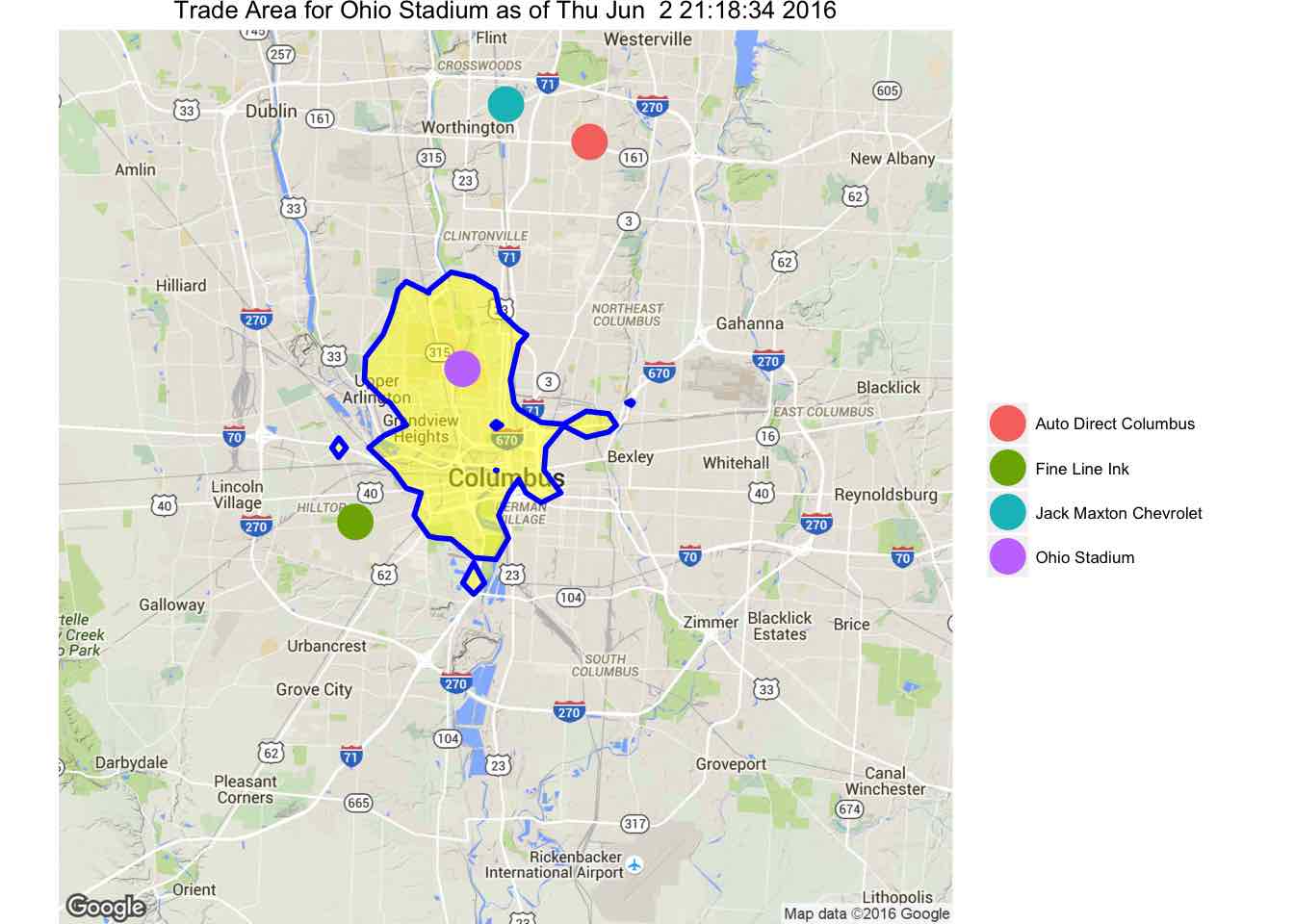
This function is a lot cleaner than the first version I posted. The results are slightly different in that the shape has changed. One interesting feature is that there are regions not connected to the main polygon. This is a result of having a finite number of points to construct the contour. Also, there is a hole in the main polygon. This means that there are points that you can’t get to in ten minutes despite the fact that there are places farther away that can be reached in ten minutes.
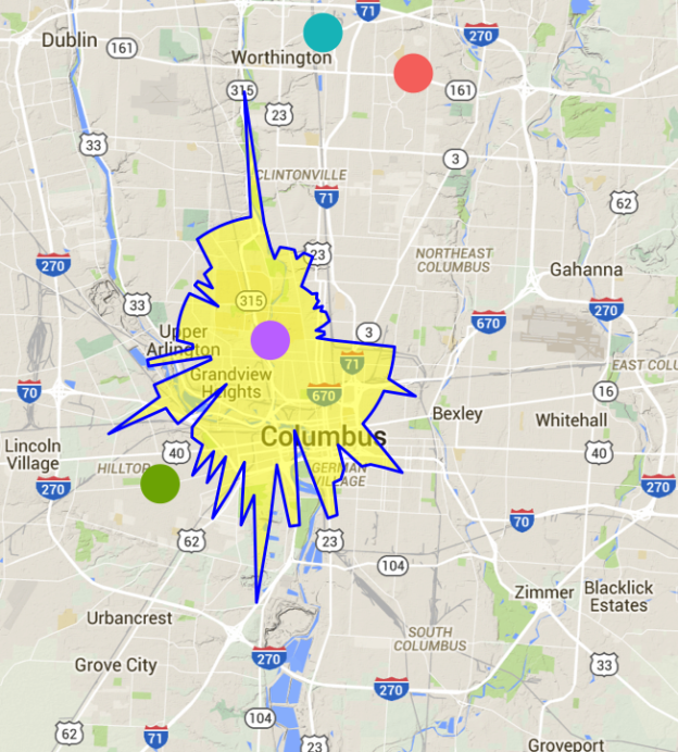
For some time now I have been looking for a good open source way to calculate drive time polygons (i.e., isochrones). Honestly, I was only looking for solutions and not trying to figure out how to do it. Inspired by this python solution (actually, by the idea of using Google Maps to get the drive distance between points and solving an optimization problem), I created a function in R to do this. Note: this is the first of two ways I have to draw these isochrones. This one will only draw convex isochrones.
The entire algorithm with examples follows after the jump.
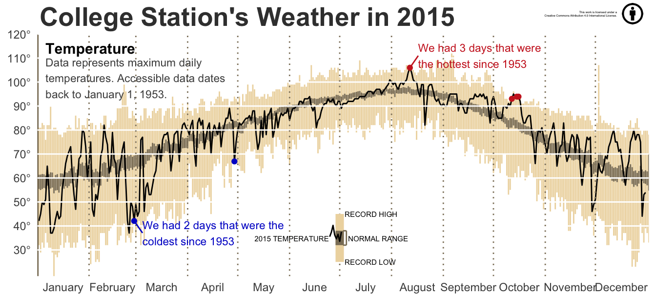
In my special topics course on Big Data analytics, we recently covered the use of Dplyr. As part of that lecture I created the above image. It is based on the thorough description of creating a similar image for a different period/location found at this site.
The data set contains information from the College Station airport weather station and dates back to 1953.
After finishing this book, I’m still not sure how I feel about it. It was an enjoyable read and a short enough book that it didn’t feel like a chore to read. I also feel like the author was trying to develop larger themes that did not quite make it across.
This book is about an aged detective coming out of retirement to solve one last case (all set against the English countryside in WWII). Though it sounds like a noir plotline, it is nothing of the sort. The exposition feels light, though the material it is dealing with is somewhat dark. The perspective of the narration changes throughout the novel in an interesting way. The detective keeps bees as a hobby and the local Anglican minister is an immigrant from South Asia married to an Englishwoman.
These are the kind of details that I feel should be important, and I am sure they were intended to be, but they did not make much of an impression on me. Perhaps I didn’t read the text closely enough (it wouldn’t be the first time), or maybe the points made were a so on the nose that the larger themes didn’t coalesce for me. I suppose both could be options.
On the other hand, there were some great passages in the book. The scene of the old detective bee keeping was great passage, and the description of the the characters arriving in London during WWII was very thought provoking. Beyond these, the description of how the countryside was affected by the war alone made the book worth reading.

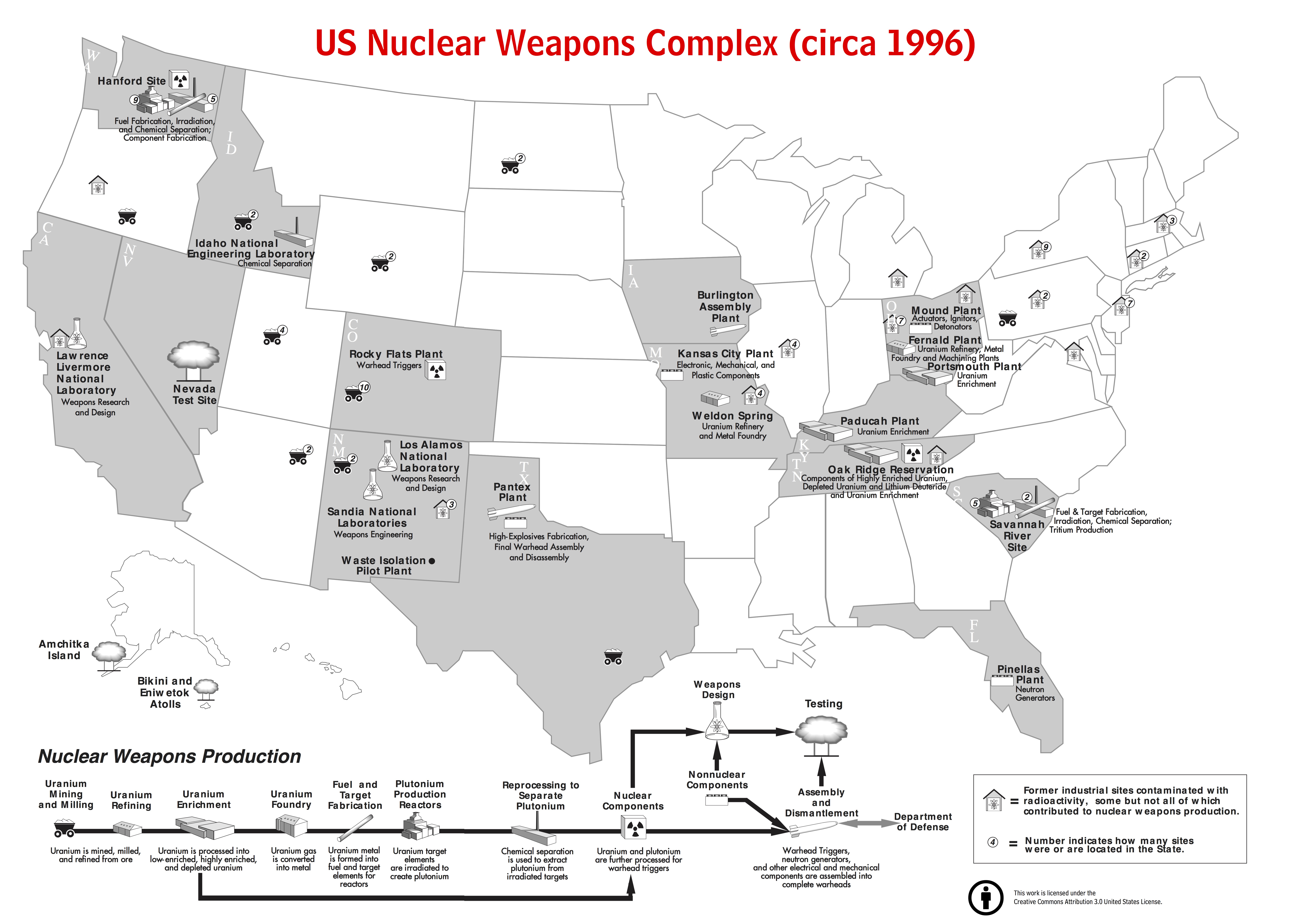
The nuclear engineering department is moving buildings this week, and a found a copy of Closing the Circle on Splitting the Atom, a Dept. of Energy report about cleaning up the nuclear waste that was a legacy of the Cold War nuclear weapons program. I’m not sure where I received my copy: probably someone was discarding it in a previous move.
There was an interesting map in the document showing the weapons complex at that time (1996). The problem was that it was poorly separated across two pages and in the electronic version the map does not appear contiguously (it is still split across two pages).
I have corrected this is and changed some of the text so that it is a standalone image. I did not take the time to fix the appalling font kerning, maybe I will do this at some point in the future.
As someone who doesn’t remember the Cold War much (and the millions younger than me) it is hard to imagine the size of the weapons complex during the Cold War. This map only shows the sites are were still active in 1996 and not the many other smaller sites that are only indicated by a single marker in the respective states.
A pdf version of the map is here
A larger jpeg version is here
The other day I was interested in drawing a fairly simple nuclear reaction network in$$\LaTeX$$. I thought that tikz would be a good way of doing this. Basically, tikz is a way to generate vector graphics directly inside the $$\LaTeX$$ source code. I figured that somebody would have an example online of how to draw a simple directed graph with annotations on the connections.
There does exist a fairly new package called tkz-graph that is specifically designed for drawing such a graph. Unfortunately, there are some limitations that affected my final image. One thing I wanted to do was color the nodes of the network with different colors to demonstrate different linear chains in the network, but that seems to be difficult with the current version as coloring nodes differently is not currently supported without defining a node type for each style.
The end result was pretty nice
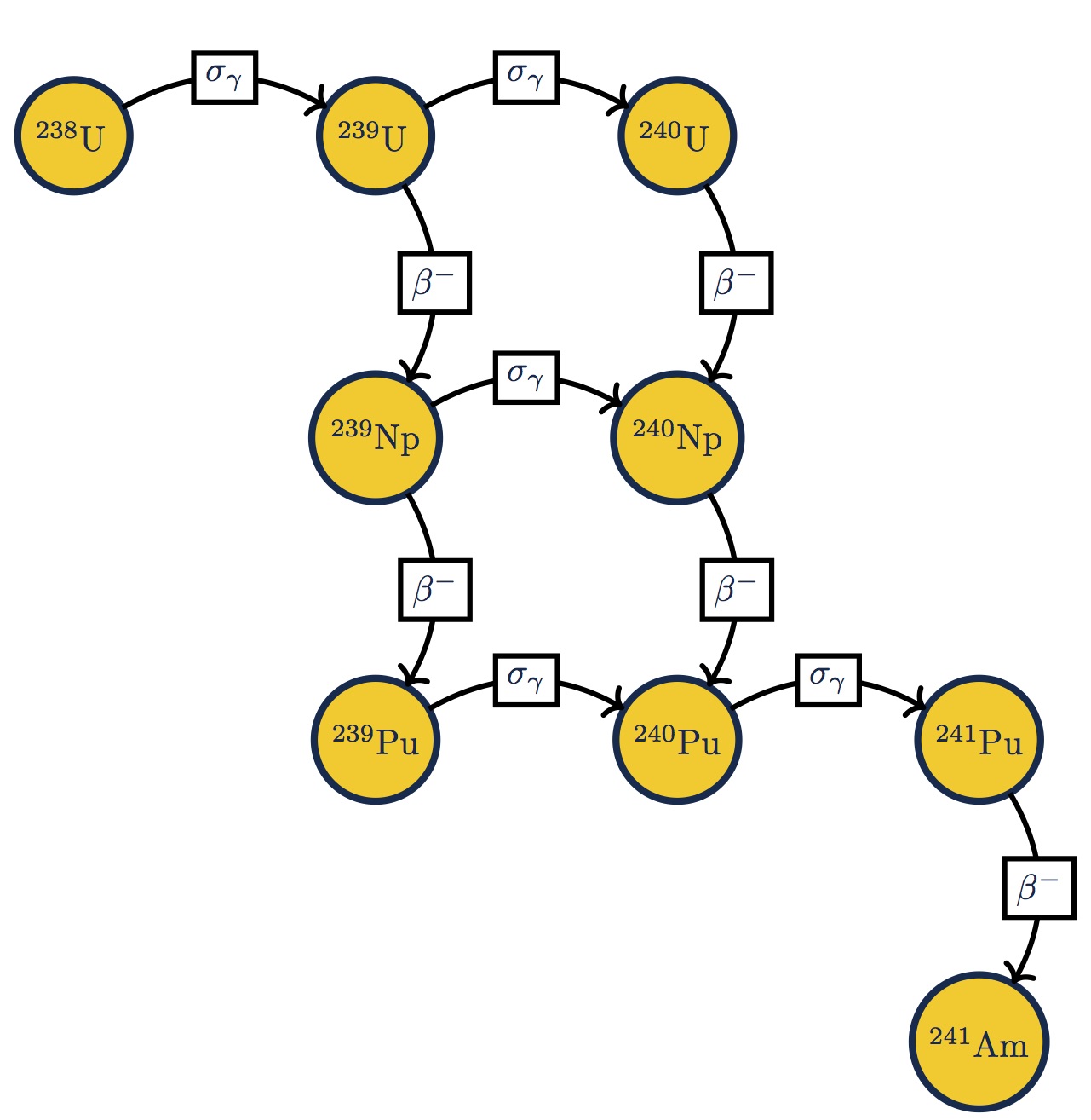
Transmutation and decay network for uranium-238
This network could be much more involved insofar as there could be higher nuclides plutonium, but the point here is to illustrate how these networks can be draw in $$\LaTeX$$.
The code for this figure is given below, after the jump. Continue reading
Those nuclear engineering students who are just starting school again, need to start thinking about summer already. The best route to getting a job after graduation is through the connections you make with internships. The experience you get with an internship will help you decide what aspect of nuclear engineering you want to work in after you graduate. They also give employers a chance to see how you work and if you are a good fit for their organization.
That being said, the internship process can be lengthy. I suggest that this month you start to talk to professors in your department about possible internships next summer. Tell them what you are interested in and ask for his/her advice. Then when you’ve identified the companies, and even better if its a manager, make contact this fall so that you are on the radar when hiring decisions are made.
The long lead time is important in nuclear due to security as well. Most facilities have some sort of back ground investigation before you can be admitted to the workplace. That means finding an internship in April is too late for a lot of places.
Good luck!
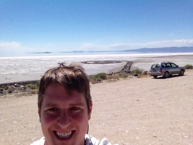
I had heard about Spiral Jetty, the land art piece in the Great Salt Lake, probably over a decade ago. On a recent trip to Idaho National Lab, I was scheduled to drive from Salt Lake City to Idaho Falls on a Sunday afternoon.
During my flight out to Salt Lake, two serendipitous moments related to Spiral Jetty occurred. First, I was reading Camille Paglia’s Glittering Images while waiting for a flight. In the section on Walter De Maria’s Lightning Field, a similar outsize art installation in the American West, Paglia mentioned Robert Smithson’s Spiral Jetty as another example of this kind of art. I then looked on my phone to find, a bit to my chagrin, that going to see Spiral Jetty would be about 1.5 – 2 hours out of my way. I didn’t think I really wanted to spend that much time.
Then, on the plane I was reading this article in the Wall Street Journal about travel tastemakers’ travel wish lists. On one of the lists was Spiral Jetty. That sealed it: I was going to make that drive into the desert.
The various websites that give guidance on visiting Spiral Jetty (I’d recommend the Dia website linked above as they are the organization that manages the artwork) say that
It’s probably about time I mentioned what Spiral Jetty is. Basically, it’s a spiral made out of rocks that juts out from the shore. Yet, the setting for this sculpture is what gives it a power. As I mentioned you drive into the middle of nowhere, not seeing any cars or buildings for miles. When you get to the shore of the lake there is no sign of civilization other than Spiral Jetty and its small number of visitors. The surrounding landscape is bleak, as in post-apocalyptical bleak. Let’s not forget that it is sited in a giant, dead lake that extends all the way out to the horizon. In this bleakness, emerges this well-ordered, and precise spiral indicating the presence of a great deal of human effort and planning. Seeing the art work in this context is what gives it power.
When I arrived at the work, there were 3 other people there walking on the rocks (something that you are allowed to do). I first took some pictures before descending down to the shore. As I started walking out, the others left and I was alone. Utterly alone. At this point on the edge of the lake, the water melts into the horizon. I marched out to the end of the rock formation along the salt-crusted dry lake bottom, salt crystals crunching under by bare feet. This turned out to be a bad idea because the crystals were large enough to be painful to walk on when I reached the spiral part of the formation. Putting my shoes back on I walked on the rocks over the spiral shape, circling around several times. I took several pictures and then walked back.
The drive back to the main road passed the site of the joining of the eastern and western legs of the first transcontinental railway at Promontory Summit. I stopped in, paid the entrance fee, and saw the actual tracks where it was joined. They have two restored locomotives that they actually drive around. Don’t look for the actual Golden Spike used to join the tracks, it is in a museum at Stanford, which, I suppose, is the prerogative of the owner of the railway.
